Plotting
The objective of this lab is to give you practice in plotting data and, more specifically, on how to work with the Matplotlib library.
Getting started
Open up a terminal and navigate (cd) to your
cs121-aut-15-username directory, where username is your
CNetID. Run git pull upstream master to collect the lab materials
and git pull to sync with your personal repository.
Once you have collected the lab materials, navigate to the lab8
directory.
If you are on a VM, make sure that Matplotlib is installed on the VM. There was a Piazza post a long time ago asking you to do this, but it was only required if you wanted to see the plots on Lab #2 so, in case you didn’t install Matplotlib at the time, make sure you run the following:
sudo apt-get update
sudo apt-get install python3-matplotlib
Matplotlib
Matplotlib is a popular plotting library for Python. It supports a variety of plots that can be tweaked and customized in many different ways. So, while producing simple plots with Matplotlib is very easy, getting all the details right (and figuring out the exact Matplotlib code to do so) can sometimes be challenging.
Thus, when working with Matplotlib, it is common to follow two steps:
- Start by experimenting with Matplotlib interactively from a Python interpreter. When doing this, each call to a Matplotlib function will usually alter a plot interactively, which is very convenient when figuring out the exact Matplotlib code for our program.
- Once we have figured out the code to produce our plot, we save it to a Python program which, when run, produces the full plot in one go (either displaying it in a window or saving it to a file).
In this lab, we will first go through these two steps in detail with a simple example. Then, we will show you two plots which you should produce following the same methodology. This way of working will also be very useful in PA #7.
Plotting interactively with IPython
Matplotlib can be used interactively from any Python interpreter, but IPython in particular has a “pylab” mode that pre-loads all the Matplotlib functions, allowing us to easily use them from the IPython interpreter. To start the interpreter in this mode, run the following:
ipython3 --pylab
We have provided a plotting.py file which includes the data that
we will plot in this part of the lab. Run the following to import this
data into the interpreter:
from plotting import TEMPS_MIN, TEMPS_AVG, TEMPS_MAX
Each of these variables is a list with 31 floating point numbers,
representing temperatures in Chicago during each day of the month
of January 2014. TEMPS_MIN contains the minimum temperatures,
TEMPS_AVG the average temperatures, and TEMPS_MAX the
maximum temperatures. The first element of each list is the
temperature for January 1st, the second element corresponds to January 2nd, etc.
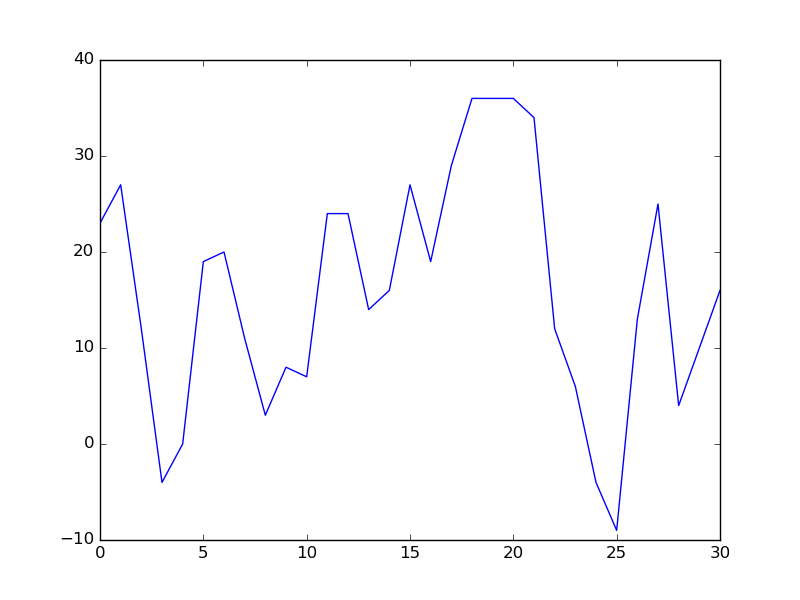
We can plot the average temperatures just by running this:
plot(TEMPS_AVG)
This should open up a Matplotlib window (titled “Figure 1”) with a graph that looks roughly like this:
Don’t worry if the graphs you see don’t look exactly like the ones you see on this page; they just have to look roughly the same.
Before continuing, close the Matplotlib window (i.e., the window with the graph; never close the window that is running IPython).
Now, let’s try plotting multiple lines. Start by running just this:
plot(TEMPS_AVG)
The same graph as before should appear. If possible, move the Matplotlib window in such a way that you can see both the graph and the IPython interpreter. Now, without closing the Matplotlib window run the following:
plot(TEMPS_MIN)
plot(TEMPS_MAX)
Two additional lines should appear, and you should see them appear on the Matplotlib window. The result should look like this:
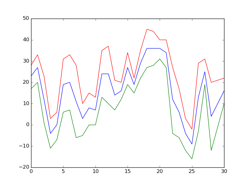
As you can see, given a list of values, we can very easily create a line
plot just by calling the plot() function. However, the resulting graph
is very basic: it has no title, no legend, no axis labels, etc.
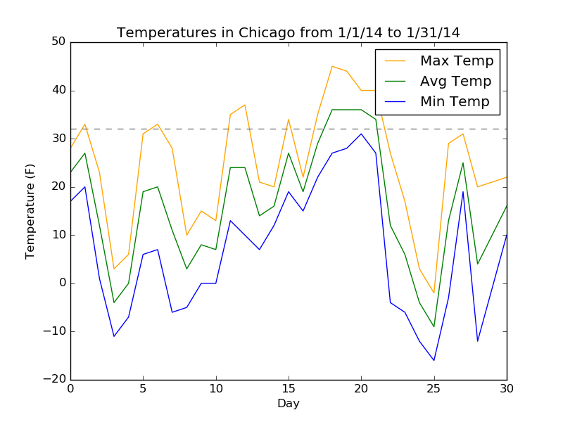
Let’s produce a more complete version of this graph. Close the Matplotlib window
and run the following on the IPython interpreter. The first call to plot() will open a
Matplotlib window. Notice how every call after that (not just the other
two plot() calls) modifies the plot interactively:
plot(TEMPS_MAX, color="orange", label="Max Temp")
plot(TEMPS_AVG, color="green", label="Avg Temp")
plot(TEMPS_MIN, color="blue", label="Min Temp")

title("Temperatures in Chicago from 1/1/14 to 1/31/14")
xlabel("Day")
ylabel("Temperature (F)")

axhline(32, color="gray", linestyle="--")

legend()
The resulting graph should look something like this:
Writing plotting code in a Python program
Now, let’s see how the plotting code we wrote works when we
include it in a Python program. Edit the plotting.py
file to include this function:
def simple_plot():
    plt.plot(TEMPS_MAX, color="orange", label="Max Temp")
    plt.plot(TEMPS_AVG, color="green", label="Avg Temp")
    plt.plot(TEMPS_MIN, color="blue", label="Min Temp")

    plt.title("Temperatures in Chicago from 1/1/14 to 1/31/14")
    plt.xlabel("Day")
    plt.ylabel("Temperature (F)")

    plt.axhline(32, color="gray", linestyle="--")

    plt.legend()
Notice how the calls to the Matplotlib functions start with plt..
This is because the Matplotlib functions are not loaded the same
way as in the IPython interpreter. We need to import them explictly like this:
import matplotlib.pyplot as plt
Now, exit the IPython interpreter, and run ipython3 without the --pylab option:
ipython3
Now, run the plotting.py file:
run plotting.py
And call the simple_plot() function we just added:
simple_plot()
At this point, nothing should happen. The reason for this is that, when we’re not running code interactively, we need to explicitly tell Matplotlib to show us the plot. We can do so like this:
plt.show()
Notice that, when running Matplotlib non-interactively, your code will
block whenever you call plt.show(). I.e., you need to close the
Matplotlib window for your program to continue running (or, in this case,
to return to the IPython interpreter).
Instead of calling show() from IPython, let’s add it to our
simple_plot() function:
def simple_plot():
    plt.plot(TEMPS_MAX, color="orange", label="Max Temp")
    plt.plot(TEMPS_AVG, color="green", label="Avg Temp")
    plt.plot(TEMPS_MIN, color="blue", label="Min Temp")

    plt.title("Temperatures in Chicago from 1/1/14 to 1/31/14")
    plt.xlabel("Day")
    plt.ylabel("Temperature (F)")

    plt.axhline(32, color="gray", linestyle="--")

    plt.show()
However, there is a case where the above code will behave badly. Run this:
plt.plot(range(31), color="red")
Nothing should happen (i.e., there should no new window with this plot). Now, run this:
run plotting.py
simple_plot()
You will see the temperature plot, but also a red line running through it.
The reason this happened is that, when creating a new plot, Matplotlib
will include all the plotting commands we run before show(). One
way of ensuring that we produce a plot only with the elements we want
is to call the figure() function, which basically indicates that
all the Matplotlib code that follows that call (and until show()
is called) is part of the same “figure”:
def simple_plot():
    plt.figure()
    plt.plot(TEMPS_MAX, color="orange", label="Max Temp")
    plt.plot(TEMPS_AVG, color="green", label="Avg Temp")
    plt.plot(TEMPS_MIN, color="blue", label="Min Temp")

    plt.title("Temperatures in Chicago from 1/1/14 to 1/31/14")
    plt.xlabel("Day")
    plt.ylabel("Temperature (F)")

    plt.axhline(32, color="gray", linestyle="--")

    plt.show()
Verify this is working correctly by running this:
run plotting.py
simple_plot()
The last modification we will make to our code is to add the ability
to save the plot to a file instead of showing it in a window. We can
do this by using the figure’s savefig() method. Modify the
simple_plot() function so it looks like this:
def simple_plot(save_to = None):
    fig = plt.figure()
    plt.plot(TEMPS_MAX, color="orange", label="Max Temp")
    plt.plot(TEMPS_AVG, color="green", label="Avg Temp")
    plt.plot(TEMPS_MIN, color="blue", label="Min Temp")

    plt.title("Temperatures in Chicago from 1/1/14 to 1/31/14")
    plt.xlabel("Day")
    plt.ylabel("Temperature (F)")

    plt.axhline(32, color="gray", linestyle="--")

    plt.legend()

    if save_to is None:
        plt.show()
    else:
        fig.savefig(save_to)
Notice how we’ve added a save_to parameter that defaults to None.
When we supply a string parameter, the figure is saved to the file specified by
that parameter:
run plotting.py
simple_plot("temperatures.png")
There should now be a temperatures.png file in the same directory
as plotting.py. If you open this file, it should contain the same
graph that was displayed previously in a Matplotlib window.
When it is not specified, we simply see the plot in a window as before:
simple_plot()
Including a parameter like this can make your function easier to debug, since you can easily switch from saving to a file to viewing the plot in a new window.
Plotting Weather and Crime Data
Now that you’ve worked with some simple Matplotlib code, it’s time to
produce a slightly more elaborate graph. The data for this graph
is contained in a CSV file called weather_crime.csv that contains
the average temperature in Chicago and the number of reported thefts
in Chicago for every day between 1/1/2012 and 12/31/2013. The first
few rows of the file look like this:
year,month,day,thefts,temp
2012,1,1,666,37.0
2012,1,2,267,24.0
2012,1,3,338,20.0
2012,1,4,345,33.0
2012,1,5,382,36.0
2012,1,6,396,47.0
Your code must read this data in (you may want to review the CSV examples from the Data Formats lecture) and you must produce a graph that plots the number of thefts and the temperature over those two years:
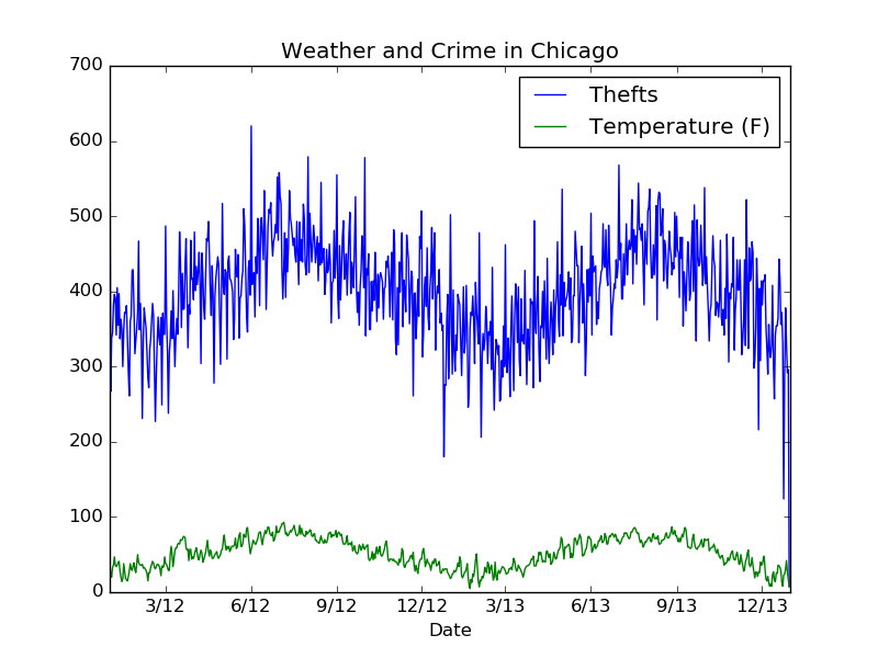
This graph informally shows a well-known correlation between certain types of crimes and the weather. In particular, there are fewer thefts in the winter because people (including criminals) tend to stay indoors.
Although this plot is more elaborate than the simple plot we saw earlier,
you should be able to produce it with plot and other Matplotlib
functions covered in class.
As you attempt to reproduce this graph, we encourage you to follow the same two steps
we followed earlier: first play around with Matplotlib in the IPython interpreter
(remember to run it with the --pylab option), and then write a function
in plotting.py that produces this graph.
Creating an Error Bar Graph
This final exercise is a bit more challenging, because it involves producing a type of graph we did not see in class:
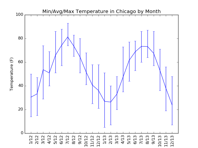
This graph shows the average, maximum, and minimum temperatures for each month
between January 2012 and December 2012. To produce this graph, you must take
the data in weather_crime.csv and compute the average, maximum, and minimum
temperatures before you can call the Matplotlib functions. You may find it
helpful to read the Matplotlib documentation on creating error bars
and the Matplotlib gallery page on error bars.
As before, first write your code in IPython, and then write a function
in plotting.py that produces this graph.
When finished
When finished with the lab please check in your work (assuming you are inside the lab directory):
git add plotting.py
git commit -m "Finished with lab8"
git push
No, we’re not grading this, we just want to look for common errors.