cs223
Buttons, Mailboxes, and 2D Graphics
In this tutorial, we will work through several more examples of FRP in Elm. Our motivating application will be building an integer counter that can be updated with buttons.
We will start with the application State:
type alias State  = Int
type CounterEvent = Inc | Clear
initState         = 0
upstate e i       = case e of
                      Clear -> 0
                      Inc   -> i + 1
To warm up the development process, we will first define main in terms of a dummy constant signal.
stateOverTime : Signal State
stateOverTime = Signal.foldp upstate initState (Signal.constant ())

main = Signal.map2 view stateOverTime Window.dimensions
And, to set up the basis for our GUI, we start with a simple rendering function that writes the current value of the counter to the middle of the screen. We bind some libraries to single letter names for brevity (e.g. E for Graphics.Element, T for Text, and C for Graphics.Collage). Notice how E.container is used to define a sized Element with content placed in a particular Position within, and E.flow places a list of Elements next to one another in a particular Direction.
view i (w,h) =
  let caption = i |> toString |> T.fromString |> E.leftAligned in
     E.color Color.gray
  <| E.container w h E.middle
  <| E.flow E.down [ caption ]
Underneath the counter display, we want to draw two buttons, one for incrementing and one for clearing. The Graphics.Input library offers the following to build buttons:
button : Message -> String -> ElementWhat is a Message (defined in Signal)? This type describes a value that gets sent to a particular Mailbox (also defined in Signal). Okay, so what is a Mailbox?
Mailboxes
Mailboxes provide a way to create "pipes" through which messages (of a specified type) can be sent from one part of an Elm application to another. They are created by the function:
mailbox : a -> Mailbox aI like to think of mailboxes as "dynamically generated signals." But why is there a need for a separate mechanism?
In the programming we have done so far, we start with the bunch of primitive signals that Elm provides, and then we derive other signals in terms of them. But these derived signals do not generate new kinds of events or messages. Instead, an entire program can be thought of as propagating the updates to primitive signals. This program structure is exhibited by the acylic nature of signal graphs.
But what if the programmer wants to define new signals? For example, say the programmer wants to draw n buttons to the screen, each of which should have its own events, such as Mouse.clicks only that it is "local" to the button rather the entire window. Well, if the programmer knew exactly what the number n is, and if Elm provided enough separate button signals (Button1.clicks, Button2.clicks, Button3.clicks, etc.), then these primitive signals could be used. But what if this number is large, and what if it's not known before running the program? For this, we need a way to dynamically generate signals.
Mailboxes are the solution that Elm provides. They are a separate mechanism than signals, and they are impure. Every time the mailbox function is invoked, it creates a new pipe in the world that can be used by application components to communicate.
Gasp! We are already breaking outside of the purely functional model? Other, more expressive formulations of FRP do not require a separate mechanism like this. In these "higher-order" FRP systems, signals of signals can be used to encode dynamically generated signals. But along with this expressiveness comes other challenges, both in design and efficient implementation, that are the subject of ongoing research.
In contrast, Elm strikes a balance of "first-order" FRP that prohibits signals of signals, and instead provides this separate mailbox mechanism for the common case of dynamically generated buttons and HTML elements that need to respond to typical browser events. Part of the novelty in Elm is that it provides an increasingly practical implementation of this language design choice. Time will tell whether the balance it strikes is a good fit!
A Mailbox is actually a record with two components:
type alias Mailbox a =
  { address : Address a
  , signal  : Signal a
  }
The first is a unique Address for this Mailbox (assigned internally when calling the mailbox function), and the second is a Signal with all of the Messages (in particular, the values of type a) that are sent to this Mailbox.
Finally, to construct a Message to send:
message : Address a -> a -> MessageNotice that the type Message does not reveal which Address it can be sent to; this information is internalized, or encapsulated, in the Message.
Back to Buttons
Going back to our example, we need to create a Mailbox for our button to send Messages to.
buttonMailbox : Mailbox CounterEvent
buttonMailbox = mailbox Clear
Now we can use button to specify the Messages to send:
incButton   = button (Signal.message buttonMailbox.address Inc) "Increment"
clearButton = button (Signal.message buttonMailbox.address Clear) "Clear"
Then, we'll draw the counter and two buttons separated by some space (using List.intersperse and E.spacer).
vspace = E.spacer 0 10

view i (w,h) =
  let caption = i |> toString |> T.fromString |> E.leftAligned in
     E.color Color.gray
  <| E.container w h E.middle
  <| E.flow E.down
  <| List.intersperse vspace [ caption, incButton, clearButton ]
Finally, we tie our Signal State to the values sent to our Mailbox:
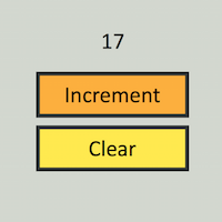
stateOverTime = Signal.foldp upstate initState buttonMailbox.signalNow we have a working counter! Check out the source and the demo.
Styling Buttons
Having gotten the basic functionality of our counter working, let's now make it look better. The function
customButton : Message -> Element -> Element -> Element -> Elementin Graphics.Input takes three Elements to draw depending on whether the button is up, hovered over, or down, respectively. We can make use of this to use different colors for each.
myButton msg s =
  let b = button msg s in
  customButton msg
    (E.color Color.lightYellow b)
    (E.color Color.lightOrange b)
    (E.color Color.lightBlue   b)
Calling myButton instead of button in view then renders our slightly fancier buttons. This is cool, but the default styles are still not very pretty. It would be nice to have borders around the buttons and also change the font style to make it more readable. Looking through the type signatures in Graphics.Input, Graphics.Element and Text, there do not seem to be library functions that will do exactly what we want. So, we'll have to work with a lower-level "unstructured" graphics library.
Unstructured 2D Graphics
Graphics.Element has many useful layout functions, but if we want to do more freeform drawing, we need to use the Graphics.Collage library. The working type is a Form and there are many ways to create them.
Functions like circle and rect create Shape values.
circle : Float -> Shape

rect : Float -> Float -> Shape
How do we convert Shapes to Forms? Searching the documentation for the type signature "Shape -> Form" reveals several functions, such as filled and outlined.
filled : Color -> Shape -> Form

outlined : LineStyle -> Shape -> Form
Once we are done building some Forms, how do we convert them to Elements so that they can be rendered? Ah, searching for the type signature "Form -> Element" reveals the following:
collage : Int -> Int -> List Form -> ElementAnd what if we have an Element that we want to mix into an unstructured graphics canvas. Searching for "Element -> Form" reveals:
toForm : Element -> FormLet's now put some of these tools to use in order to style our counter buttons. First, let's use the Text library to format strings more nicely.
strStyle : String -> E.Element
strStyle = T.fromString >> T.height 30 >> E.centered
Next, let's define a custom line style for drawing borders rather than the default one provided called defaultLine. These values are described by the record type LineStyle that contains several parameters. We only want to customize a subset of these parameters, so we can use record update syntax to create a new record that is just like defaultLine except for a couple changes. If we try the following...
lineStyle = { C.defaultLine | color = Color.darkCharcoal, width = 10 }we get a syntax error. The issue is that the parser (by design) requires the record being copied and updated to syntactically be a variable, not an identifier qualified by modules like C.defaultLine. No matter, there are two very simple workarounds. One option:
lineStyle =
  let defaultLine = C.defaultLine in
  { defaultLine | color = Color.darkCharcoal, width = 10 }
Another option is to modify the import:
import Graphics.Collage as C exposing (defaultLine)We will now draw custom buttons, but we will define each of the three Elements using collages rather than ordinary buttons like before.
btnW = 200
btnH = 60

myButton msg s =
  let drawButton c =
    C.collage btnW btnH
       [ C.filled c (C.rect btnW btnH)
       , C.outlined lineStyle (C.rect btnW btnH)
       , strStyle s |> C.toForm
    ]
  in
  customButton msg
    (drawButton Color.lightYellow)
    (drawButton Color.lightOrange)
    (drawButton Color.lightBlue)
The myButton function draws a button in three steps: first, the solid color, then the border, and then the button label. The list of Forms passed to collage is interpreted to be in increasing z-order, meaning each successive element is rendered on top of the previous. As a result, we must put the label after the solid rectangle so that it does not get hidden.
As a final tweak, let's change the style of the counter display to match our buttons. So that the display is centered, we create a container of the same width as the buttons and center the text within it.
...
let caption = i |> toString |> strStyle |> E.container btnW btnH E.middle in
... 
Our counter is now much more stylish than before! Check out the source and the demo.
Minor note about syntax: When writing an expression like a list literal on a new line ([ C.filled ...] above), the parser may complain if there are fewer than three spaces more than the line above it. Try two spaces and observe the error for future reference.
"Pure Buttons"
From the documentation of Signal.mailbox: "Creating new signals [via mailboxes] is inherently impure." So dynamically generating buttons dynamically affects the signal graph (particularly, creating new kinds of input to the graph), breaking the purely functional model. Some of you may not have been able to fully enjoy our button example in light of this. If you have been wondering to yourself whether there is some other way, I applaud you for your purity when it comes to purity.
There is an alternative to using channels to define buttons in Elm, but it comes with other major downsides. The idea is to use only primitive mouse signals, and keep track of where buttons are in the window manually in our own code. In other words, we can roll our own little event system and renderer. This approach will throw out many of the benefits provided by the abstractions in Graphics.Element. But, we could follow this approach if we are really determined. We will work through part of what it would is required to implement the counter application using "pure" buttons.
Whenever the mouse is clicked, we need to determine whether its position is within a "button" or not. So we will have to keep track of the button's boundaries (in pixels). In addition to the counter, let's display the position of the last click for development purposes.
type alias Pt    = (Int, Int)
type alias State = (Pt, Int)
initState        = ((-1,-1), 0)
The positions reported by Mouse.positions treat (0,0) as the upper-left corner of the window, so we use negative x- and y-values to denote the initial state when there have been no clicks.
For simplicity, let's position the counter display and buttons in the upper-left corner one on top of the other with no space in between. This will simplify our pixel calculuations. After defining the width and height of our display and buttons, we can then update the counter in State only if the click appears within the boundaries of a "button."
btnW = 200
btnH = 60

upstate : Pt -> State -> State
upstate (x,y) (_,i) =
  let inPlace i = x <= btnW && y >= i * btnH && y < (i+1) * btnH in
  let j = case i of
            1 -> i + 1   -- Increment "button"
            2 -> 0       -- Clear "button"
            _ -> i       -- elsewhere
  in
  ((x,y), j)
We then set up the controller to trigger updates based on changes in the most recent mouse click position.
clickPositions : Signal Pt
clickPositions = Signal.sampleOn Mouse.clicks Mouse.position

stateOverTime : Signal State
stateOverTime = Signal.foldp upstate initState clickPositions

main = Signal.map view stateOverTime
Or all in one:
main =
  Signal.map view
    (Signal.foldp upstate initState
      (Signal.sampleOn Mouse.clicks Mouse.position))
Lastly, the view. When using the Graphics.Collage library, it is important to realize that the coordinate system for collage is centered in the middle of the collage, and move (supplied with positive arguments) translates Shapes in a collage up and to the right. (You probably discovered this on your own while working through Homework 1.)
Here's a really quick-and-dirty rendering of the counter and buttons that takes these two factors into account.
strStyle : String -> E.Element
strStyle = T.fromString >> T.height 30 >> E.centered

view : State -> E.Element
view st =
  let rows     = 3
      w        = btnW
      h        = rows * btnH
      place i  = C.moveY (btnH - (i-1)*btnH)
      rect c   = C.filled c (C.rect btnW btnH)
      text c s = C.toForm <| color c <| strStyle s
  in
  C.collage w h
    [ place 1 <| rect Color.lightGray
    , place 1 <| text Color.lightGray <| toString st
    , place 2 <| rect Color.lightYellow
    , place 2 <| text Color.lightYellow "Increment"
    , place 3 <| rect Color.lightOrange
    , place 3 <| text Color.lightOrange "Clear"
    , C.outlined C.defaultLine (C.rect w h)
    ]
Here is the source and demo. For fun, you may want to continue down this path and implement the entire application from before in the Mailbox-less style. If you do, take a moment to reflect on whether your views have become any less pure.